Featured in ART Magazine
Sitting before a blank canvas can fuel an artistic block for many painters – especially those of the spontaneous, abstract variety that never paint from photos or figures. But when Britten encounters a fresh canvas, her imagination begins churning.
“I focus on my inner world rather than my outer world,” she says. “Somehow staring at a blank canvas clears my mind and opens the door to creativity. Looking into pure white is similar to closing my eyes. Eventually colors and vibrations begin to emerge. I don’t try to capture them, I just notice them as a feeling washes over me. I reach for the colors that best translate the feeling.”
The Vail-based artist grew up in San Francisco and studied painting in Florence, Italy. Her work is character- ized by a collage of colors and layers, comprised of water-based paint, oil, resin, metal and occasionally sprin- kled with unlikely materials such as vinegar, salt and champagne. She never has a clear object in mind as she paints, but often her pieces resemble swirling landscapes, colorful gardens or a bright montage of fallen leaves. Because she paints intuitively, her only intention is to create a specter of beauty. The finished product is a surprise to her as much as other viewers and she cherishes the “get to know you” component of meeting each piece.
“Each painting is an individual,” she says. “Like a person, some paintings re- veal themselves to me immediately and others are slightly shy and require more patience. Some boldly yell their names and others make me guess for a while.”
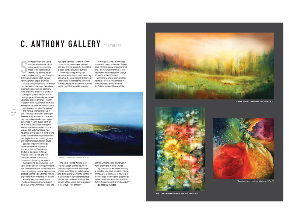
It is only after she spends some time becoming acquainted with each piece that Britten names her work. She has a piece entitled “Splendor,” which, comprised of soft oranges, yellows and lime greens, abstractly resembles a faded pond surrounded by trees.
“When I saw the painting I felt incredible warmth and could see its light almost as if it were back lit,” Britten says. “It reminded me of meeting someone who radiates grace and beauty from the inside. I simply enjoyed its splendor.”
The piece entitled “Annica” is set to a dark ocean-colored backdrop, the colorful yellow, pink and orange shapes resembling lily pads floating one-dimensionally while the front layer is comprised of highly detailed pieces of what look like butterfly wings. But as with all her works, its interpretation is in the eye of the beholder..
“When I saw ‘Annica’ it reminded me of wildflowers in the rain,” Britten says. “’Annica’ means impermanence and I felt the impermanence of this beauty because the seasons change so rapidly in the mountains.”
While many artists approach their next body of work with a theme in mind or at least a color scheme, for Britten, she won’t know what’s coming until she has a paintbrush in hand and begins making strokes.
“My studio is a place where anything is possible,” she says. “Creativity has no limits and when I allow it to flow, it is effortless bliss. When we see possibilities rather than limits, it inspires us to live fully. Life seems a little more beautiful.”
— by shauna farnell